Here is our Music Video:


Below are the front panels of our digipak:

Below are the outside panels to our digipak.

Below are the outside panels to our digipak.

Below are the inside panels to our digipak.

Below are the inside panels to our digipak.

Click on the image below to access our website.

Thursday, 2 November 2017

R+P Post 16: My Band or Artist

Artist: Duo called "Cruze" with singer Mahalia Jordan (female) and Alex Grey (male)
Genre: R&B/Garage
Age: 20 and 21
Location: Both from London
Personality: Both have a very unique style and are very creative


The two met while they were in school however they did not speak until they saw each other at an open mic night where they decided to join to create a musical act. 

The Duo gained coverage from the site SoundCloud where they uploaded their music and gained massive amounts of coverage. Soon after they were signed by Nimbus Records.

The logo of the Duo is below


R+P Post 15: My Record Label

Our record label is called 'Nimbus Records'. 
  1. An independent label -  It promotes the artists individuality as well as the music 
  2. It focuses on London based artists. 
  3. There is a clear aim to create unique and fresh sounds from sub-genres to give the world a taste of underground music.
  4. Nimbus Records is a subsidiary label of Sony music  one of the 'big three' recording companies- this means that it will have the needed funding to allow for artist growth and marketing through radios, TVs, social media etc. however it will still allow for the artist to keep control of their work since it is independent  
Below is the logo 


This logo includes a Roman soldier with a halo who is on top of a mountain, near a cloud that goes by the name of Nimbus. This cloud comes from classical mythology, it is a shining cloud that surrounds a diety. This links in with our record label as we would like for it to provide sunlight and or growth for our artist causing them to grow and learn. The artist in the analogy would be the diety showcasing the level attentiveness that will be shown from the record label. 

R+P Post 14: My Target Audience

Primary Audience

The primary audience for r&b/garage music is 16-25 and mostly females. Females are usually targeted by r&b/garage artists because they stereotypically write songs about love, being in love and heartbreak. These type of songs will appeal to teenage girls and young adults as it usually relates to them. The social demographic for this genre is also working/middle class but weighted more on the working class side. Hobbies of my target audience include going to concerts to see their favourite artists spending time with friends and using social media. In terms of fashion and style, it's very typical that it is also in trend or is current and popular at the time. This is because it is what most people are wearing to fit in with the current fashions. My music video will meet the uses and gratifications theory as not only will it be entertaining. But the song choice and lyrics will hopefully be relatable for some of the audience.


R+P Post 13: Influences and inspirations from art, fashion and culture

Art

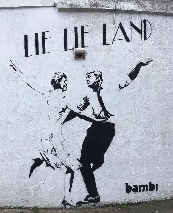
Our artist is inspired by cool/urban sounds and landscapes, and so the different kinds of art that I have been inspired by relates to this. For example, street art like graffiti. This is the primary form of expression on the London streets. Famous artists who partake in graffiti include Banksy, Phlegm and Stik.

The importance of graffiti is underpinned by cultural value among the youth as it is about reflecting the reality they see in urban environments. It is a form of art available to view for the masses, a way to beautify spaces and create a sort of identity using images words and colour. It may have a broader social commentary, which is applicable to artists like Banksy who is also considered a political activist


This influenced us mainly because graffiti is a method used by the youth to express themselves and their culture/views. This is something we would like to do with our music video, having our artists' culture/life being visually represented. As it is important for our group that our artist is unique and not a robot created by a label.


Fashion

Our fashion influences mainly draw from pop culture. The relationship between fashion and popular music is one built on mutual creativity. It is important as it allows youth subculture to articulate themselves through fashion. The fashion that we will be trying to present in our music video is one that encompasses "athleisure" a common trend where 90s sporty fashion has reintroduced itself into the mainstream. Research made by Morgan Stanley shows that sports apparel and footwear sale have jumped 42% to $270 billion over the past seven years. And prospects for growth are getting stronger rather than weaker, as this trend goes global

Below is a screenshot of the costume ideas that we have
Culture

We were especially influenced by youth subculture is a group of individuals who are united through a common value system and tastes such as clothes politics and music. This is particularly important as the artists are apart of this subculture and this subculture is also our audience.

Tuesday, 31 October 2017

R+P Post 12: Artists/Bands that have influenced my ideas

Kali Uchis
Kali Uchis is very influential in terms of the makeup choice for our artist and the extras. Kali usually wears quite bold makeup that has a very 1950s style makeup which was a very glamorous decade for women's makeup. Although we won't be using this 50s style, we will still be incorporating the idea of a bold makeup look.


Kali also promotes her columbian culture a lot, she does this most with her music by releasing Spanish versions of her already popular songs and new Spanish songs. The idea of culture and identity is something we want to stress with our artist aswell to make them more personable and authentic.

 
Kali Uchis was a huge influence for our group. Her music video for "Tyrant" had a huge focus on lighting and performance which we drew from a lot, specifically the lighting effect where there were various colours on rotation. As well as this, her music video showed us a whole new side to camera movement which gave the illusion of special effects

Skepta
As an artist, Skepta is always discussing controversial topics. He does this in his music and during interviews on varying radio shows. This most definitely promotes individuality and shows the world that he's more than just an artist and has many different sides to him. This is something we want to express with our artist. 

As well as this, Skepta's vision for representing the 'gritty' and 'urban' side of London is something that we too are trying to showcase in our Music Video. He done this very well through the use of costume as he mainly wears sports clothing - hoodies, caps, tracksuits, nike shoes. This in conjunction with the wide location shots of the estates he uses in his Shut down music video work together to create a very cool vibe. Skepta clearly wants to show what he believes in through a visual medium which will also try to through the use of our narrative.

Here is a gif showing what I just discussed: costume, location which adds to Skepta's brand image and personality


R+P Post 11: Artist websites that have inspired and influenced my ideas

1. Ariana Grande's Artist Website

Ariana Grande's website is very promotional, as marketing is made very clear with the first thing an audience member would notice is the "Arimoji" app which is available for purchase on the app store, with links to Amazon and iTunes on the side. Aside from this, her website has a very simple set up, something my group could easily do with a black and white colour scheme, showing that minimalism can also lead to a successful website.

merchandise section so that consumers can do more than
just buy her singles and albums, they can by her merch as well

Here is her available album - ready for purchase and streaming 

clear tabs for the consumer to navigate around the website
Website Review 1:

Overall, the website has a very clear and professional feel and a clear identity, this was made clear by the fonts and artwork and the overall colour scheme. There are some good aspects to this website that make it very easy to navigate throughout the website but at the same time very classic and minimal. The navigation bar allows for users to go to the different areas of the website, for example, the videos and the stores. There are also links on the home page to these areas making it slightly quicker to use as it acts as a shortcut.

2. Lady Gaga's Artist Website

Lady Gaga's website was particularly influencing as her brand image was clear throughout. She had bold images that matched with her outgoing personality as well as this it is linked in well with her genre and lyrics which to share a very outgoing element. Therefore the website acted as a great method in terms of synergy. Lady Gaga's website had a clear focus on Lady Gaga as an artist with photos taking up a large portion of the website. This influenced us as we too want to have a huge focus on the artist and the artist's work/art. Her website was also very engaging with the moving images on either side.

clear available tour dates so that her
fans can get tickets
clear social media platforms, so that her consumers can
follow every aspect of her life
clear tabs for the consumer to navigate around the website

merchandise section so that consumers can do more than
just buy her singles and albums, they can by her merch as well

Website Review 2:

Overall, there is a clear definition of the style and the uniqueness of lady gaga. Because lady gaga is so individualistic with what she wears and how she acts, this is reflected on her website. The website is very clear and looks very professional but at the same, it is very eye-catching with the bold live photos and user-friendly
Key features both of the websites had were:
  • Home Button - to get back to the main page easily
  • Social Media Links - Facebook, Twitter etc.
  • Tour section - where consumers can buy tickets
  • Photos - from Live shows, Shoots etc.
  • Available Merchandise section "shop" - jumpers, T-shirts etc.
Things that work well on these two websites
  • The navigation bar
  • The artwork
  • The login and the email sign up
  • The news feed

Monday, 30 October 2017

R+P Post 10: Album covers that have inspired and influenced my ideas


Below are some albums we looked out for inspiration.

 
What I like about these albums
- bold
-clear image of artist
-clear album name
-clear brand image


A debut album cover should:

  • Artist face covering the album – important for marketing
  • Clear artist name – important for marketing
  • Eye catching – to attract attention
  • Clear colour combos – to represent the genre of the music
  • Must haves: distributor, barcode, year of release, contact information, copyright logo, record label logo

A common theme is the artist looking directly at the camera which provides direct address. This is what I would like to have in our album cover as it will help create a relationship between the artist and the audience, a side profile would give the wrong message of a disconnected artist. In terms of fonts I would like to have something simple but also colourful and bright as that will match the genre of garage/dance. I would prefer to shoot the cover on location to give it a more gritty feel however doing it in the studio would be much better as then we would have a lot more control over the lighting

Album cover – close analysis of Katy Perry's Roar single cover

A strong theme in this single cover of Katy Perry is the 'lion'. Seen from the lion print border, the two lions on the letter 'o' as well as the jacket with a lion roaring. This connotes ideas of strength and power and by looking at context we can pull out ideas of female empowerment. However what's interesting is the fact that there is still a very feminine undertone with the cover, with pink tones and very pretty makeup. Suggesting that being both feminine and strong are not mutually exclusive. As well as this there is a very strong form of direct address, however with Katy looking over her shoulder we can see someone who is also a bit rebellious


In conclusion, this research has been very useful as I now know the conventions of an album cover especially a debut artist's one. As a result I now have clearer ideas of what I want to include for our own album cover.